
Read this if you have a hard time deciding what colors look best on you but you’re still not sure how to go about it
“A colorful trend is coming back around and responding to today’s wardrobe crisis. Color analysis — or sharpening one’s personal style game using compatible colors from the color wheel — has been said to lead to more decisive dressing. The idea is that it takes the guesswork out of getting dressed, doing makeup or hair.” ~ Leatrice Eiseman, International Color Expert
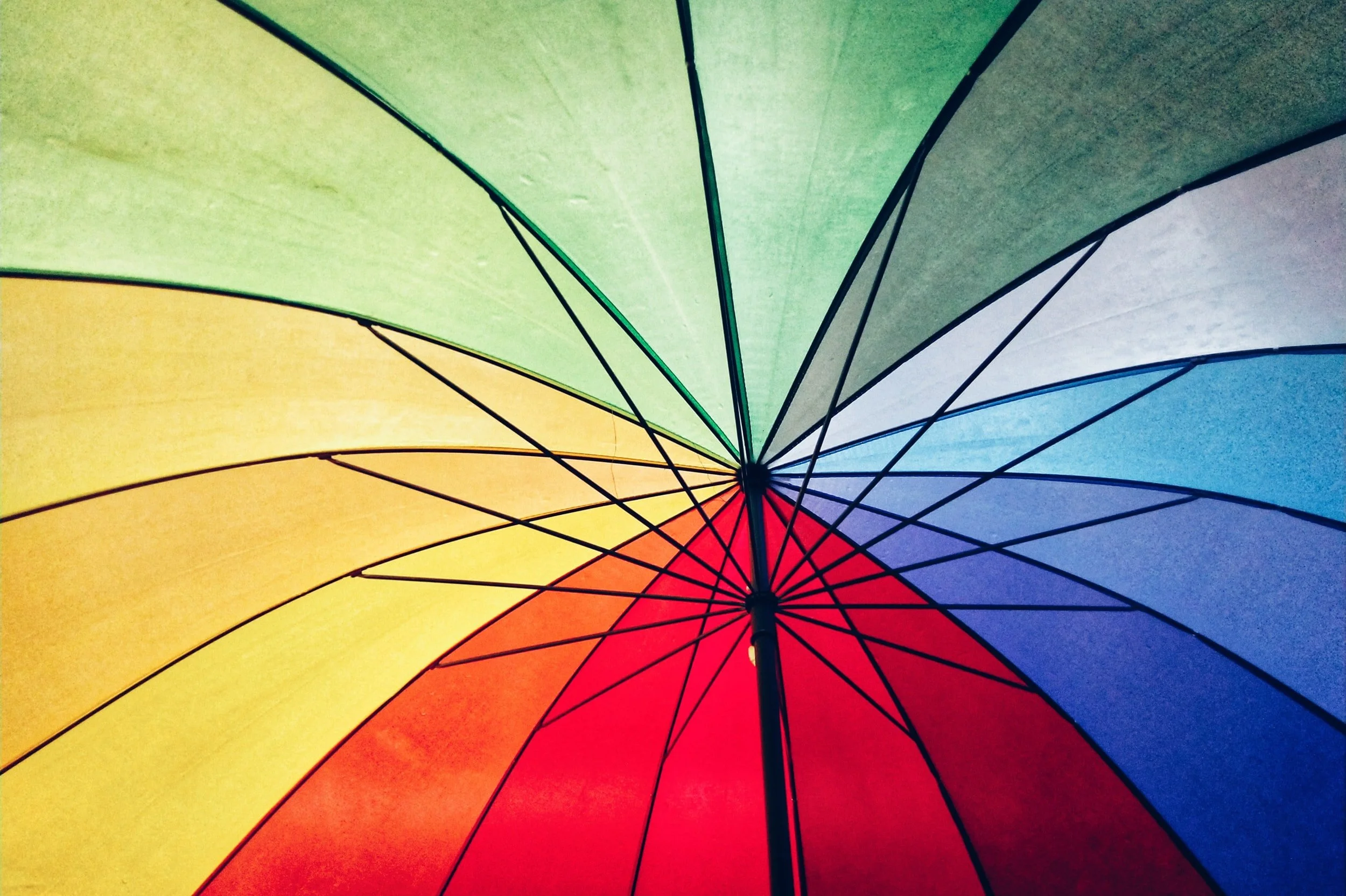
Color is everywhere, we can’t escape it. But many times, you may not know what to do with it.
It’s especially stressful when you go shopping, so many choices.
How does one decide?
Color analysis has been around for a long time, making its biggest impact in the 80’s.
I was there. As I was entering the fashion industry in the 80’s I knew it was important to understand how to use color in my profession.
More recently, COLOR has led to illuminating ones “personal brand.”
COLOR plays a big role in your decision making. Everything from website colors to your wardrobe palette to meaningful branding colors. It’s all interconnected.
What is personal color analysis?
It’s a process where one learns what COLORS look best with your eye, hair, and skin tone.
You then receive a beautiful COLOR palette that takes the guesswork out of choosing new clothing pieces.
It helps you gain confidence and zero in on knowing your most flattering shades.
It is not only a confidence builder but gives you the know-how to use color with your wardrobe but in the illumination of your personal brand.
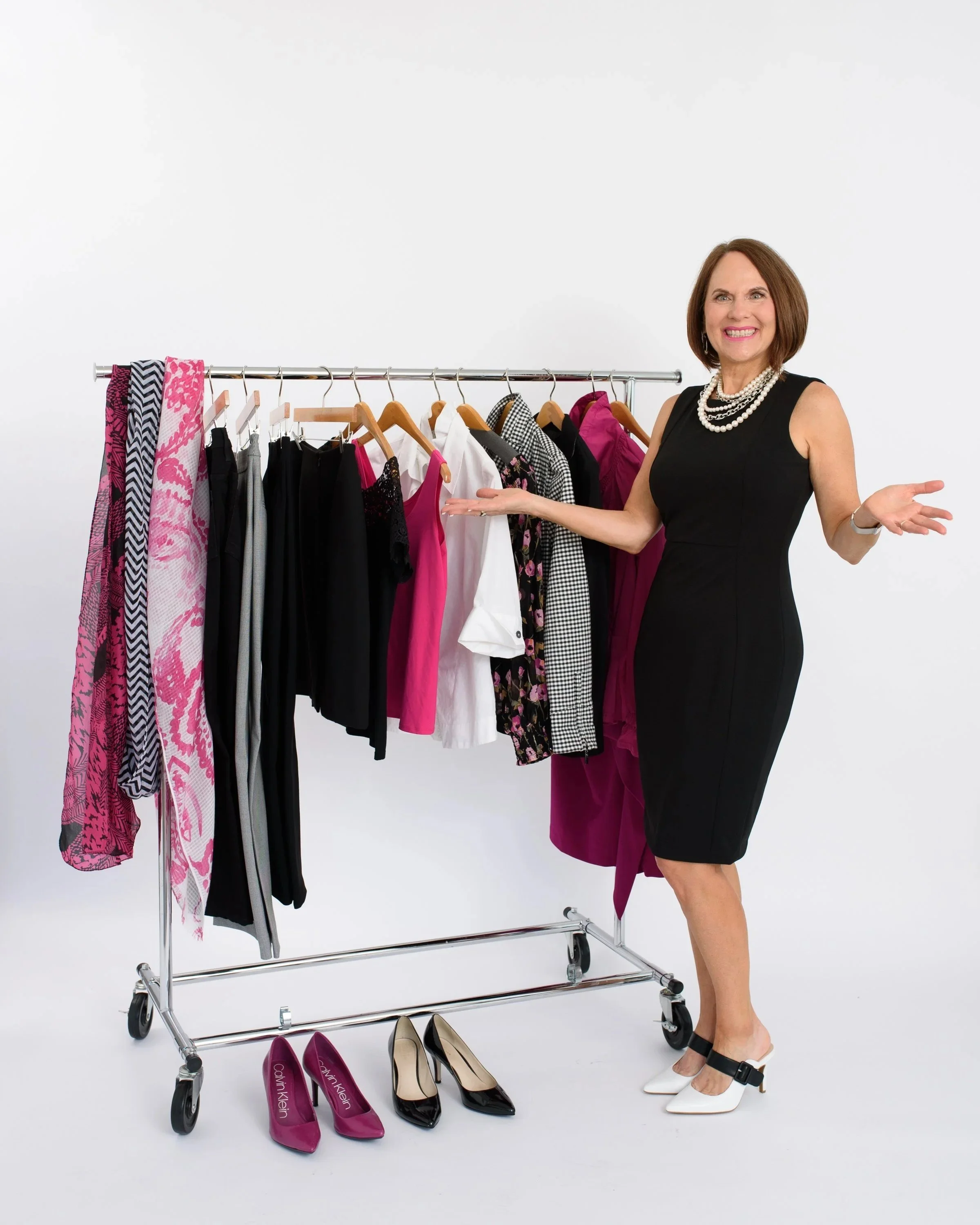
STYLE TIP! Using personal COLOR analysis for clothing selection can simplify the shopping process and help you zero in on “your colors” and ignore the rest.
Sustainability.
I’m sure you have pieces in your closet you continue to keep because you love how the COLOR makes you look and feel.
Did you know, the average consumer throws away 81.5 lbs of clothes every year (that’s 11.3 million tons of textile waste that hits landfills!)?
STYLE TIP! When you love and embrace certain colors, you hang onto pieces longer.
What is a Colortime System?
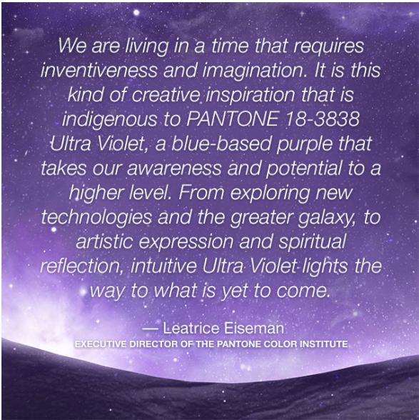
I’m honored to be a certified color consultant with More Alive With Color, Color Clock System™. It is not based on the seasons, but rather on the changing light at certain times of day.

More Alive with Color, Color Clock System
“This is a more inclusive and international method, as many people live in climates where they cannot relate to “winter” colors; they simply do not experience those cooler color temps in their surroundings.
Anyone, no matter where they live, can understand — through their own experience — the significance of the cleaner, sharper, jeweled tones of Sunrise hues, the sun-drenched subtlety of mid–day tones (which I call “Sunlight”), or the warmer drama of a beautifully striated Sunset painted across the sky.
Also included is a fourth palette called the Crossover™ colors that contains colors that are so apparent and prevalent in nature that they work with every palette. These include shades like Pantone’s Sky Blue, Sand, True Red, and Black. Pantone is the most widely-used color system used worldwide, Pantone colors are used throughout the Colortime system.” Leatrice Eiseman
STYLE TIP! COLOR is the foundation of all fashion, and it makes us feel a certain way. Why wouldn’t you want to understand how to use COLOR to put your best self forward?
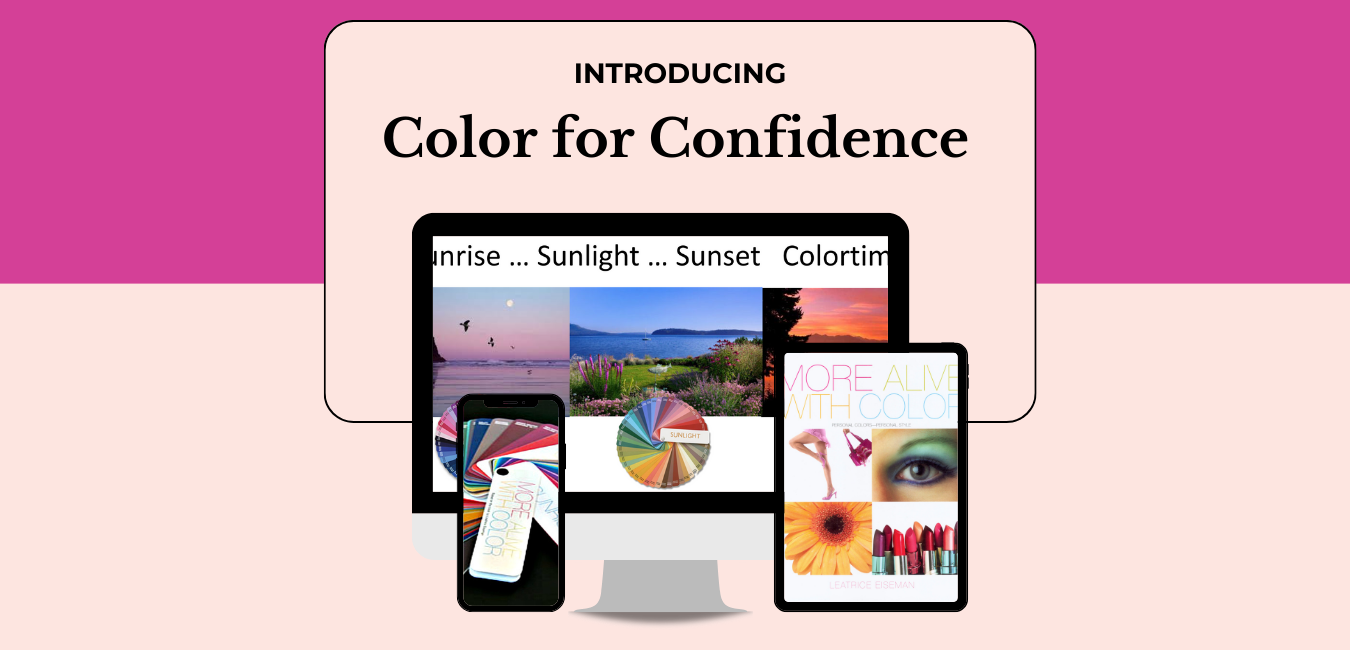
Color for Confidence
My Color for Confidence program is a hybrid self-led / in-person, (via Zoom) bespoke customized experience to help women understand and discover her BEST and most flattering colors.
Through the More Alive With Color, Color Clock System™, you will look at your unique inherent coloring, define your Signature Colors, utilize the goof-proof combinations, all of which allows you to create a wardrobe with ease, simplicity, and confidence.
You’ll then have an individualized 50-minute white-glove color session where we will clarify your best colors, mix-and-match outfits inside your closet, discern what colors are NOT good on you, and expand on how to use COLOR for your personal brand, and any other burning questions you might have about personalized COLOR for your business/personal lifestyle.
Personal Color Analysis: https://www.womenofdefinitivestyle.comcolorforconfidence
With Your Definitive Style in Mind,
💗Annette