Posts tagged Pantone
3 Tips on How To Wear the Color Basil Green

3 Tips on How To Wear the Color Basil Green

Basil is a grayed-green that is calming and soothing, a borrowed color from nature yet has its own uniqueness.

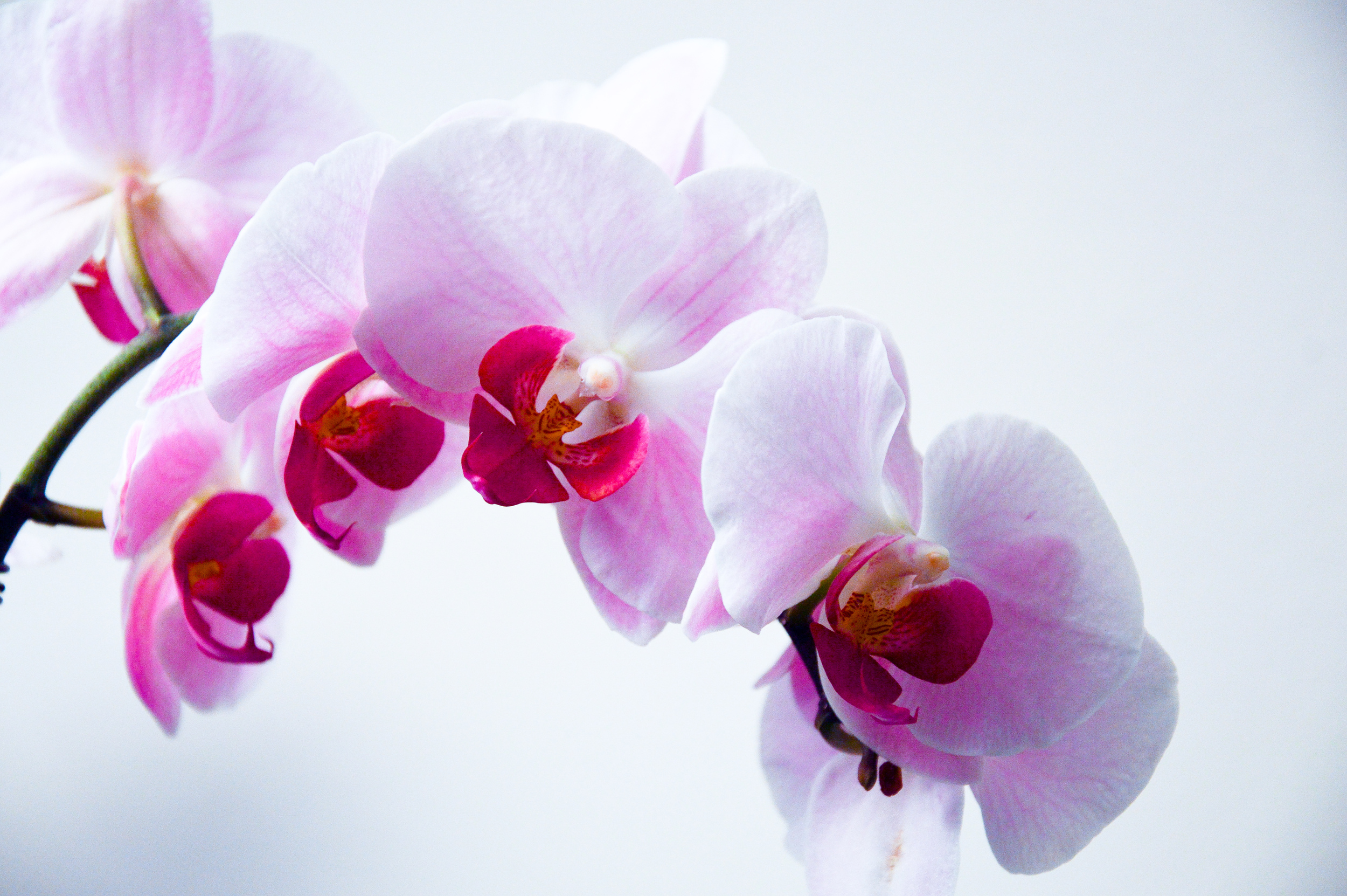
Pantone’s sweet and savory basil green emanates health and wellness.

I've worked with hundreds of women to determine what are their most flattering colors. And I have found personally, that many women are in the two camps when it comes to the color green.

They love green or they don’t. Very black and white. Or they tend to pass over the color and have never experimented with the color green.

But did you know that people who like green people are usually stable, balanced types? You are a good citizen, a concerned parent, and a loyal friend, according to Leatrice Eiseman, author of More Alive With Color.

You are intelligent and understand new concepts. 

Let's chat about the 3 ways you can incorporate basil green (or your favorite green) into your existing wardrobe and personal style. 

1. ”Try On” Your Eye Color 

  • The first thing I want you to do is to look at your eye color. 

  • Do you have a speckle of green in your eye color? If you do, I really encourage you to try on a shade of green. 

  • Did you know that when your ‘eyes pop’ you are perceived as a trustworthy person? I’m sure you’ve heard the phrase, “Your eyes are the window to your soul.”

  • If you prefer brighter tones vs. grayed or muted tones, consider emerald-green. 

2. Add Green in a Small Simple Way 

  • Think about adding the color basil or emerald in a beautiful scarf with your classic white blouse.

  • Combine a beautiful silk shell in basil green with your navy or camel neutrals.

  • How about a fun floral green cotton top for spring and summer?

3. Become Aware of How Green Makes You Feel 

  • Basil is a very soothing shade of green – it’s calming and inviting.  

  • Green is considered balanced and stable. Don’t forget, green has a personality. 

  • It doesn’t cost you a thing to try on a beautiful basil green shell, just for fun.

  • If I’m not mistaken, I believe green is Oprah’s favorite color. 


HERE ARE 3 WAYS I CAN HELP YOU DRESS WITH EASE, BE ON-BRAND, & GET NOTICED:

  1. Capture my BEST style strategies and image advice that include secrets to honoring your inner beauty, to what style basics are a must, to creating a color wardrobe capsule – Get Your Ultimate Style Guide: 7 Ways to go from feeling ‘off’ to rocking a signature look that is uniquely YOU!

  2. Work with me privately to take you from questioning your clothing and style choices to creating a signature wardrobe that is uniquely you. Schedule a 30-minute Get Dressed with Ease Breakthrough session to share a little about your image challenges and what you’re envisioning for yourself, and we’ll devise a strategy, so you are ‘stepping into your excellence’ and showing up as the powerful woman that you are and dressing with ease. https://www.annettebond.com/contact

  3. Join other like-minded successful smart women in my Style with Significance Facebook Group! This is a place to share personal styling ideas, get advice from a professional stylist, and meet other powerful professional women who value looking as good as they feel

Spring: A Season of Colorful Equilibrium
spring-style-colorful-equilibrium

"This season, consumers are looking for a state of thoughtful, emotional and artistic equilibrium".

Leatrice Eiseman, Executive Director of the Pantone Color Institute

Placid Blue, like a picture-perfect, tranquil and reassuring sky, induces a sense of peaceful calmness, while Violet Tulip, a romantic, vintage purple, evokes wistful nostalgia. Hemlock, a summery, ornamental green, provides a decorative touch that's very different from the greens of recent seasons.  Pair any of these versatile pastels with a bolder hue for an au courant look.

Sand, a lightly toasted and amiable neutral, conjures images of the beach and carefree days of summer.  Paloma serves as a quintessential neutral, interesting enough to be worn alone or combined with any color for sophisticated poise.

Cayenne, a high-pitched red, adds a dash of spicy heat to neutrals, and heightens the excitement when mixed with Freesia, a blazing yellow that is sure illuminate wardrobe this season.  Celosia Orange, an optimistic, spontaneous hue.

The palette is brought full circle with Radiant Orchid, the 2014 Pantone Color of the Year.  And Dazzling Blue, a scintillating, polar opposite to Placid Blue.

GREEN, The MYTH

How many of you knew that EMERALD Green was the color of the Year?  For those of you who didn't know, every year Pantone Color, the leading color authority for fashion and home chooses a color that represents what is going on around the world with fashion designers, decorators, our economy and anything else that might influence our surroundings such as the upcoming Olympics.  In addition to the color of the year they also select 10 Top Colors for spring and fall that will be a big influence in the marketplace.

I am going to admit right now that I have never been a green fashion person although I decorate with it all the time.  Did you know that usually there is a reason why psychologically you don’t like a color? I encourage you to take a minute to think back on your past to discover if there is a reason why you don’t like GREEN.  In my color sessions with clients, I find a great deal of them who are not fans of green and some who love it. Be aware that there are at least 50 shades of green, so if you’re one of those who don’t like GREEN, experiment with a totally new shade. I hope you’ll also consider adding some GREEN clothing pieces to your wardrobe in the near future after learning a little more about the color.

What got me excited about EMERALD is the meaning of the color.  As you can see from above, there are a lot of standout adjectives such as magnificent, lively, radiant, and striking and so many more powerful descriptions of the color EMERALD. It makes me happy when I think of these words.

Green in general describes people who are usually stable, balanced types; kind, generous and can be a good listener from Leatrice Eiseman’ Book More Alive with Color®.  I did my own FACEBOOK survey and asked my followers what they thought of the color green and these were some of their responses:

  • Love it, Vibrant, Alive.

  • Nature, Crisp, Clean.

  • Doesn't look good on me.

  • I love green in my décor.

  • Has to match my eyes in order to wear it.

  • Looks good on red heads.

  • It’s a color of healing, money and growth.

So what is your take on GREEN or the color of the year EMERALD? I would love to know!